Table of Contents
Especially when there are many linked tables with dozens of columns in a base, it is easy to lose track of how they relate to each other. Using the table relationships plugin, you can visualize which tables are linked to each other via which columns. You see the data model of your base as a relationship chart: all tables, their links and link formulas such as lookup and rollup.
You can find out how to activate the plugin in a base here.
How the plugin works
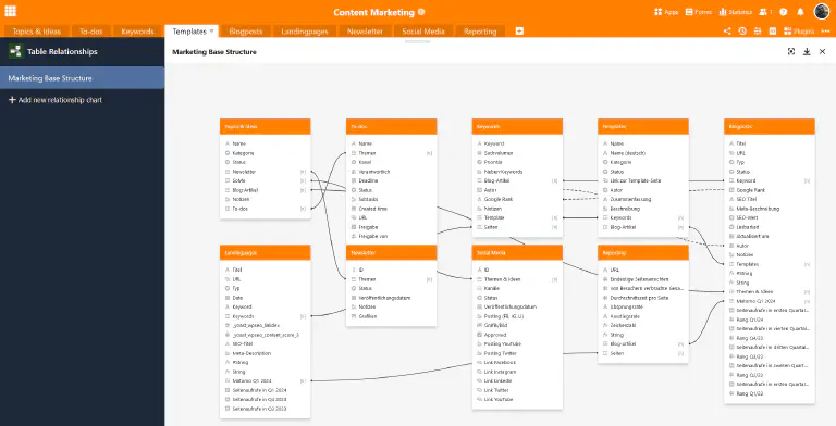
Once you have set up and opened the table relationships plugin, you will first see all the tables in the base. All columns that are created in the respective tables are listed under the colored table names.
To visualize the table relationships, you will not only see solid lines for direct links via link columns, but also dashed lines for indirect links via link formula columns (e.g. lookups).
Managing a relationship chart
By default, a chart with all table relationships is already created when the table relationships plugin is opened for the first time. If you would like to create another relationship chart, click on Add relationship chart. This opens an input field in which you can enter the desired name.
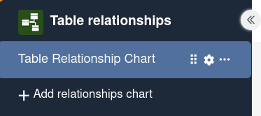
When you hover over the name of a chart with the mouse pointer, three icons appear. To change the order of the charts, hold down the left mouse button on the gripping surface and drag and drop a chart to the desired position.
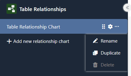
In addition, you can click on the three dots to manage the chart. The following options are available:
- rename
- duplicate
- delete
- reset
- export image
Settings of a relationship chart
In the settings, which you can access by clicking on the cogwheel symbol , you can define the following for a chart by (de)activating the sliders:
- Would you like to display links to other tables (direct connections)?
- Would you like to display links within a table (direct connections)?
- Would you like to display formulas for links (indirect connections)? If yes, which types of link formulas?
- Would you like to display all columns regardless of views?
- Would you like to display tables without links?
- Would you like to show or hide tables?
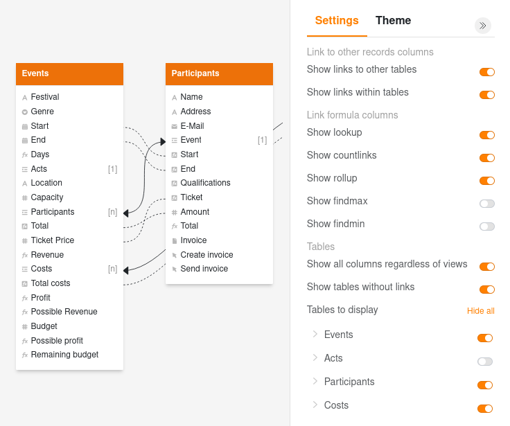
Style options of a relationship chart
Go to the Theme tab at the top right next to the settings to change the style of specific elements in a chart. Click on the drop-down arrow in front of an element to expand the available settings:
- Tables: color of the table header and font size
- Link columns (direct connections): line width, line style and line color
- Formulas for links (first-level indirect connections): line width, line style and line color
- Multi-level formulas for links (nested connections of higher levels, e.g. a lookup formula that takes values via another link column of the linked table): line width, line style and line color
- Set background color for export
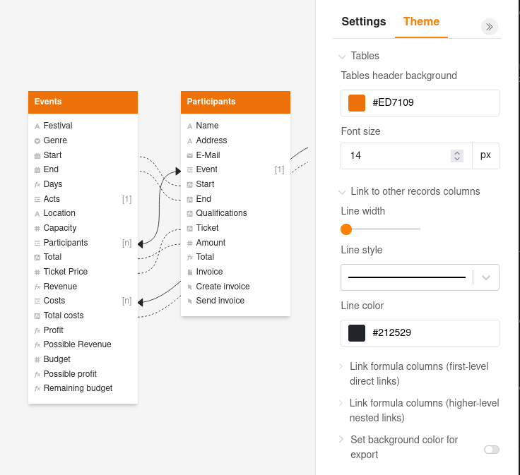
Move tables in a chart
You can move the various tables in a chart as required using drag and drop. To do this, hold down the left mouse button, drag the table to the desired position and release.
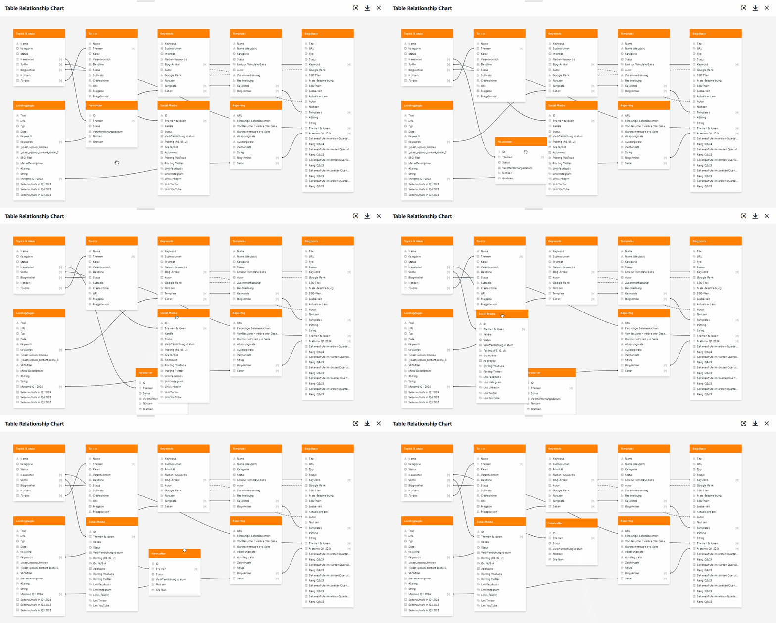
Add a note to a relationship chart
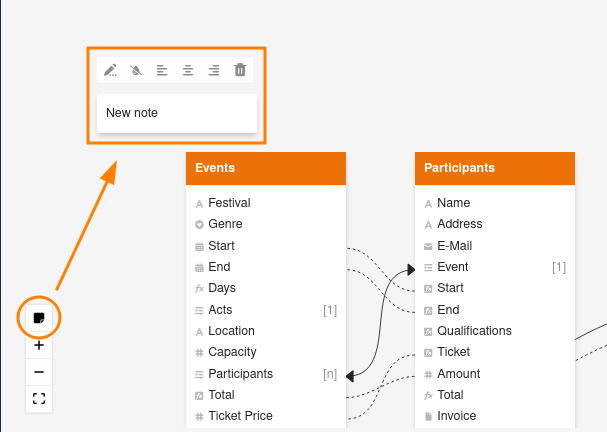
You can also add a note to a relationship chart by clicking on the note icon in the lower left corner. You then have the following options:
- edit text
- hide background
- align text to the left, center or right
- delete note