Table of Contents
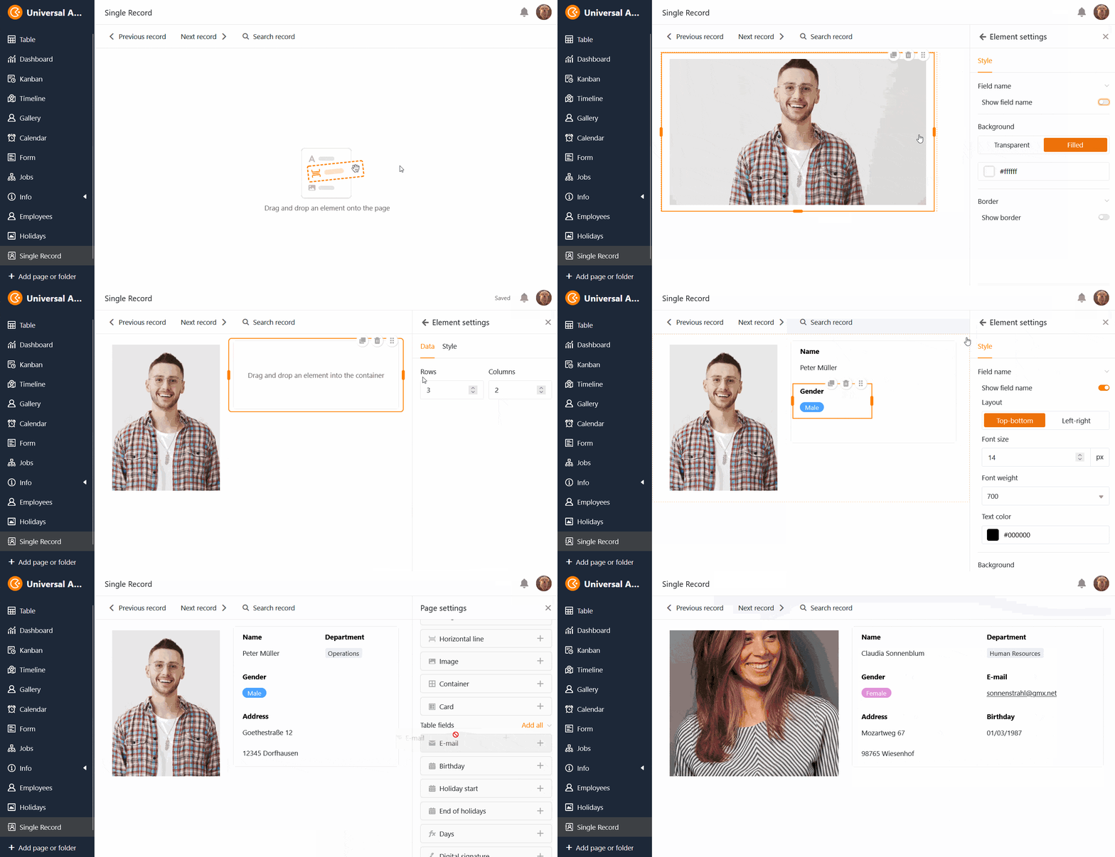
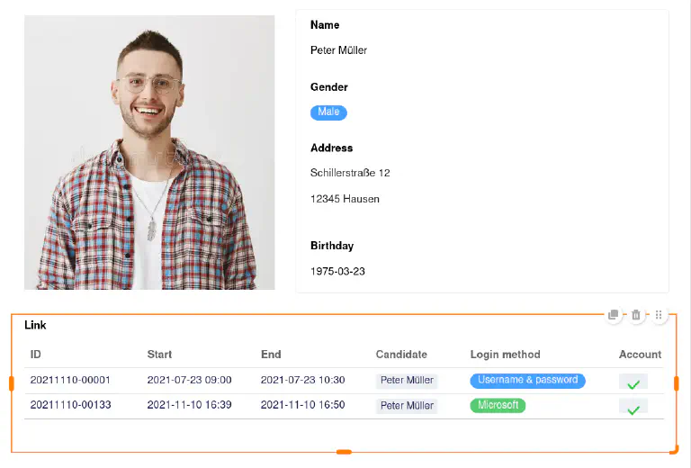
With the single record page type, you have the option of designing a page with static elements, dynamic table fields, colors, frames, etc. in order to visually prepare the data stored in a row.
Users of the app can view, search, browse or even edit the single records on this page – with the relevant authorization. This page type is suitable, for example, for displaying the data in an employee database as personal profiles.
Page settings
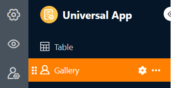
If you want to change the settings of a page, click on the corresponding cogwheel symbol in the navigation bar.
In the page settings, you can select the table in which the single records are saved.
Static elements
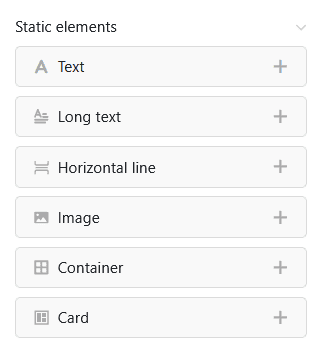
Similar to custom pages, you can also add static elements to pages of the Single Record type, which are used to design the page and remain the same across all data records. These elements are
- Text
- Formatted text
- Horizontal line
- Image
- Container
- Card
For more detailed information on the setting options for these elements, please consult this help article.
Table fields
All columns in the table from which you can insert data into the page are listed as table fields. The content of the fields depends on the single records in the table and changes depending on the record.
Just like the static elements, each table field also has its own element settings. First select whether you want to display the field name that serves as the heading of the record. If so, you can set the exact alignment, font size, font weight and font color.
You can also define a background color and a frame for each table field.
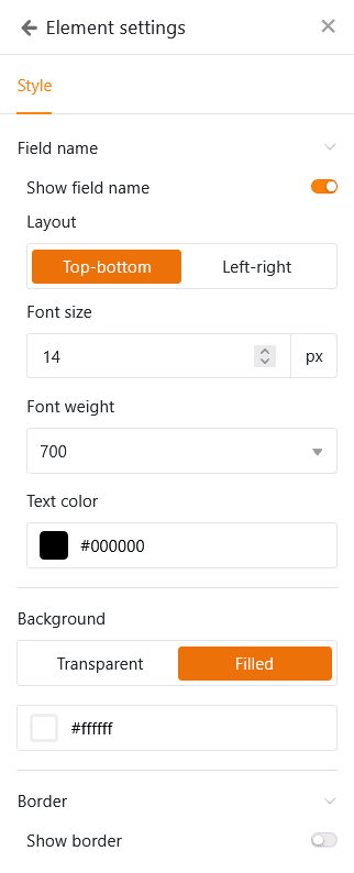
For all text and number-based column types, you also have the option of setting the font size, font weight, font color and alignment of the displayed values.
There are also a few special features for the following column types:
- For column types with a visual highlight – for example single select or collaborator columns – the labels can optionally be displayed as plain text.
- If you click on an e-mail address in an E-mail column, the e-mail client installed on your device (e.g. Microsoft Outlook or Mozilla Thunderbird) will open.
- If you click on a link in an URL column, the corresponding website will open in a new tab of your browser.
- If you click on a thumbnail in a File column, the file will open in a suitable viewer in a new tab of your browser. If an online office editor is configured, you can also open and edit Office documents directly in the browser.
- With Link columns, all entries linked to the data record can be clearly displayed in a table. You can adjust the column width and also hide columns via the element settings so that only the essential information of the linked entries is displayed.
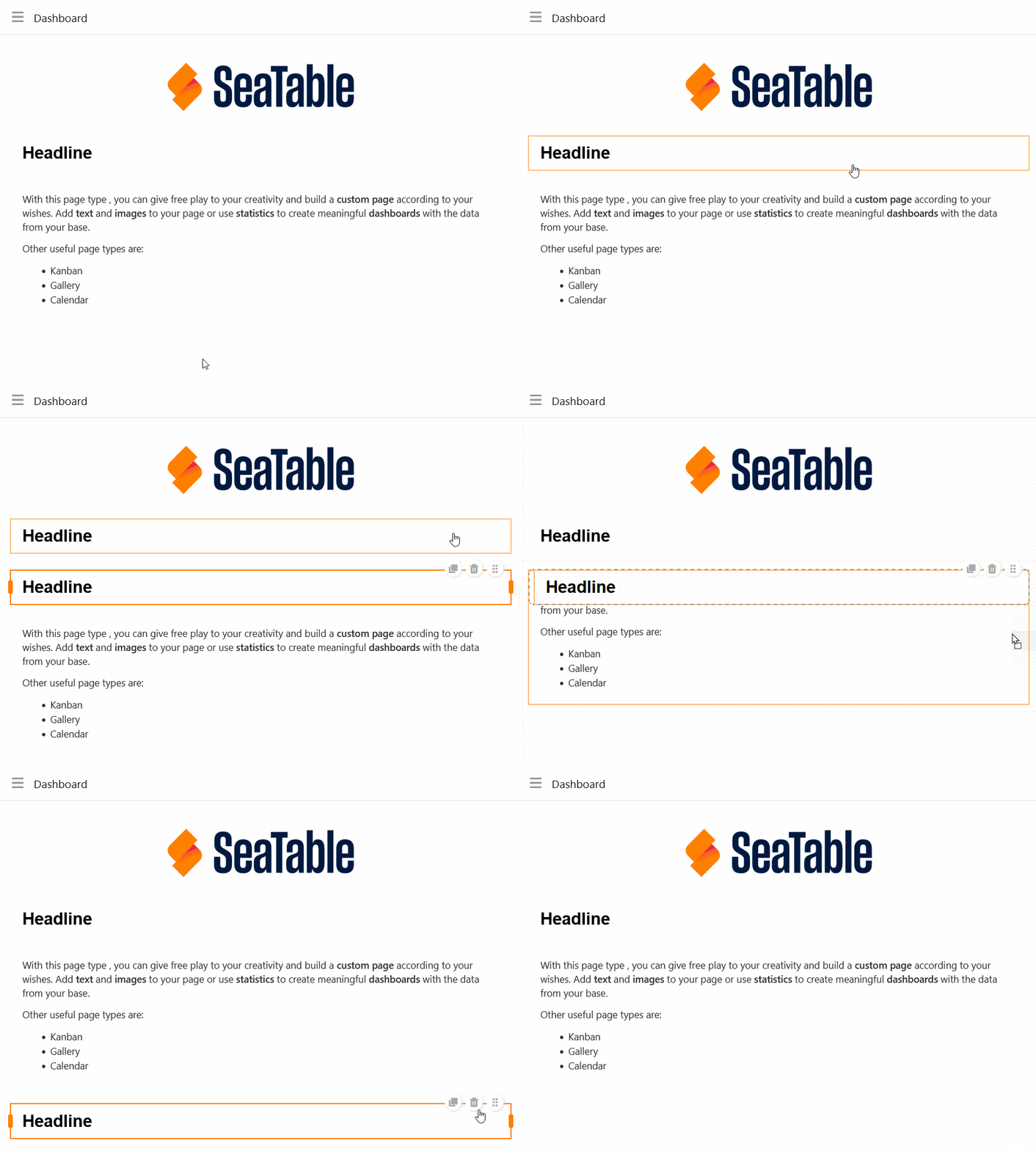
Copy, move or delete elements
If you want to copy, move or delete an existing element on your page, simply use the three corresponding symbols in the top right-hand corner of the frame.
Preset filters and sorting
You can also define preset filters and sorting to limit and organize the data records that can be displayed for users. To filter or sort, click on Add filter or Add sorting, select the desired column and condition and confirm with Submit.
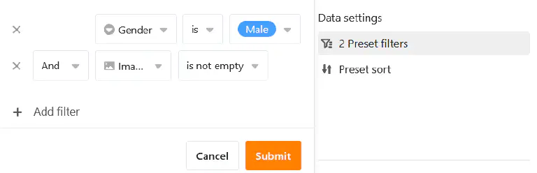
Users can only see the information for a single record that you display via the integrated table fields.
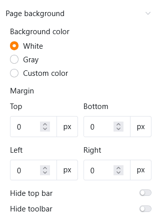
Graphic settings of the page background
You can make the following graphical settings for the entire page of the Single record type:
- Select white, grey or a user-defined color as the background color of the page.
- Set the page margins (top, bottom, left, right).
- Decide whether you want to hide the title bar.
- Decide whether you want to hide the toolbar that users can use to switch between entries.
Switch between single records
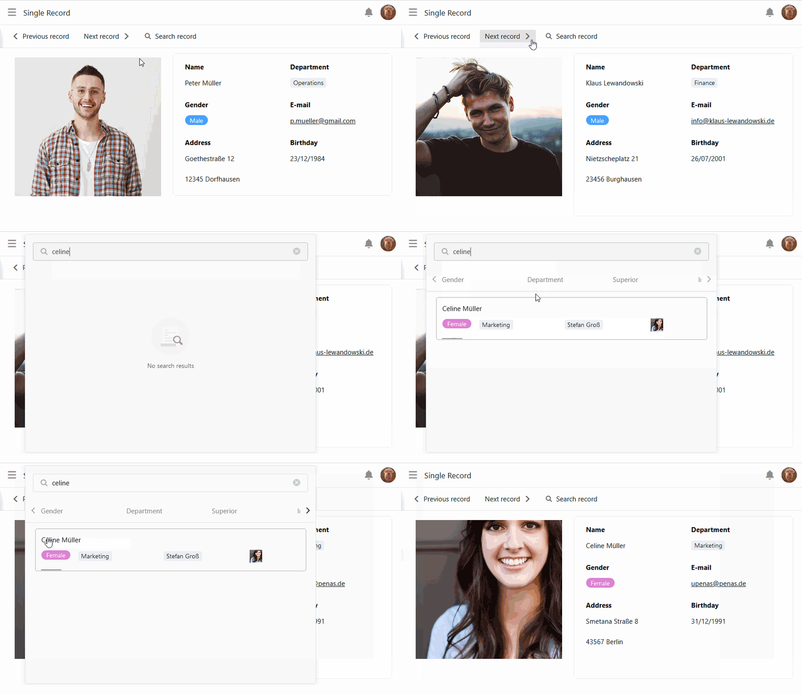
If you have displayed the toolbar, app users with the corresponding page authorization can switch between the single records. To do this, click on Previous record or Next record . You can also search for a specific record.
Modify single records
With the appropriate authorization, app users can edit the table fields of the single records on this page.
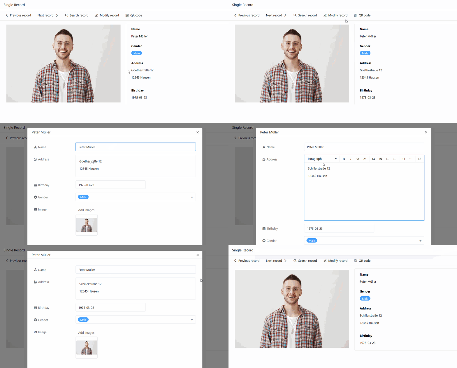
- Click on Modify record in the toolbar.
- The window with the row details opens. Make the desired changes to the data record there.
- Close the window by clicking on the x symbol to save the changes.
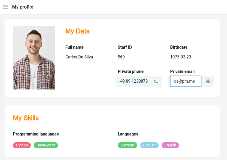
For an even smoother and more intuitive workflow, you can also edit individual table fields directly on the page. To do this, click on a field and make your changes in edit mode. They are saved immediately.
Generate QR code for single records
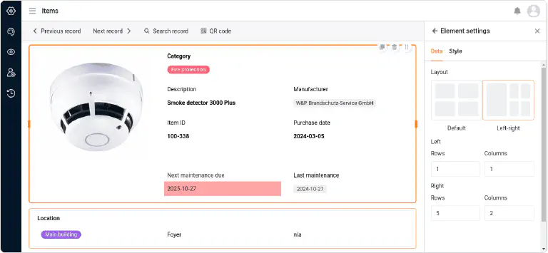
You will also find a QR code generator in the toolbar. The QR code contains the link to the currently displayed record. Attached to an object or device, you can scan the QR code using a tablet or smartphone and call up all the data in the app without any keyboard input. This makes inventory management even easier, for example.
Execute button actions
Just like on table and query pages, you can also use columns of the button type here. Whether you want to create a PDF document, edit a data record or execute a script – you can start all these button actions at the touch of a button. No editing authorization is required for this. In this way, app admins can limit user interactions for this page type to a few predefined actions.
Link column settings
In the settings for the link column, you can define for each linked table which data is visible and editable and which operations are permitted. Depending on the configuration, users may create new records in the linked table as well as link, modify and remove existing records. This allows you to control the respective permissions precisely.
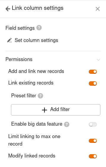
- Column settings for the linked table: Here you can define exactly to what extent the following permissions apply to specific columns.
- Add and link new records: If you activate this slider, users can add new entries to the linked table. You can use the column settings to define which columns are visible and which columns are required, i.e. must be filled in.
- Link existing records: If you activate this slider, users can link existing entries in the linked table. You can use the column settings to define which columns are visible.
- Preset filters: If you add a filter here, only options that fulfill the filter conditions will be displayed when linking entries.
- Enable big data feature: If the big data function is activated, users can search through more than 20,000 data records, provided there are this many entries in the linked table.
- Modify linked records: If you activate this slider, users can edit existing records in the linked table. You can use the column settings to define which columns are editable.
- Remove existing records: This authorization lets you specify whether users are allowed to delete existing links.
- Limit links to a maximum of one row: If you activate this slider, users can only link to one row of the linked table in the cells of the link column.
Page authorizations
You can define the following page authorizations for pages of the Single record type:
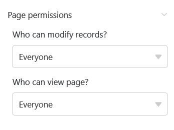
Decide who can view and edit the single records. You cannot add or delete rows in the table via this page.
Read-only columns
In addition to the page authorization “Who can edit rows ?”, you can use read-only columns to precisely define which column values of a data record users can and cannot change.
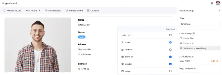
Go to the page settings and click on the boxes of the columns that should be read-only for users. You can recognize read-only columns by the fact that they are highlighted in grey in the row details.