Table of Contents
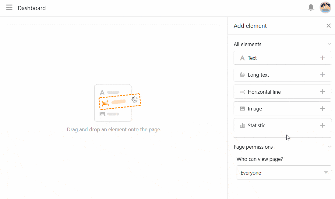
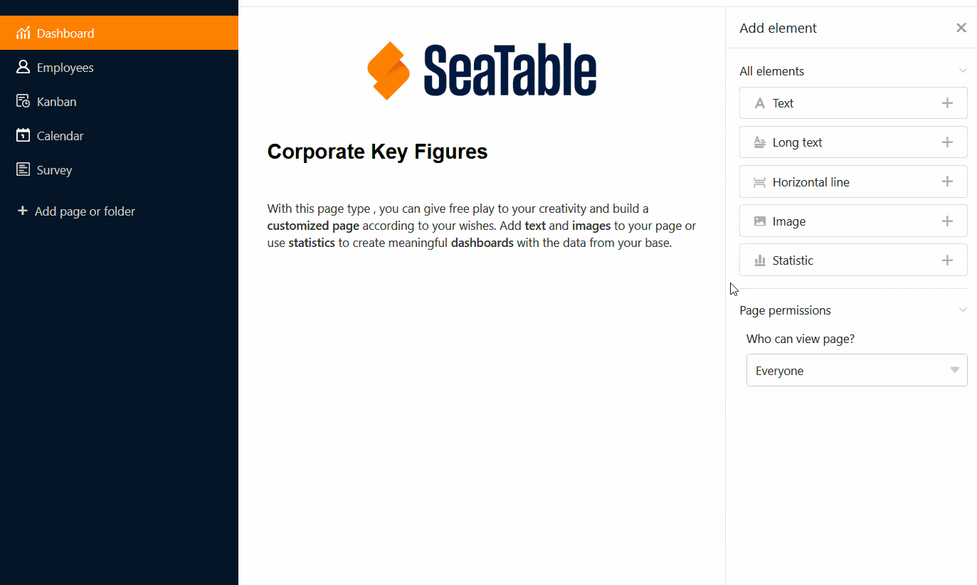
With this page type, you can give free rein to your creativity and build a customized page according to your wishes. Add text and images to your page or use statistics to create meaningful dashboards with the data from your base.
Create individual pages
If you want to change the settings of a page, click on the corresponding cogwheel symbol in the navigation bar.
You can use the page settings to add various elements to your page using drag-and-drop.
Copy, move or delete elements
If you want to copy, move or delete an existing element on your individual page, simply use the three corresponding symbols in the top right-hand corner of the frame.
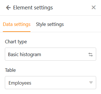
Element settings
There are additional settings for each element of the individual page, which mainly affect the formatting and graphic configuration.
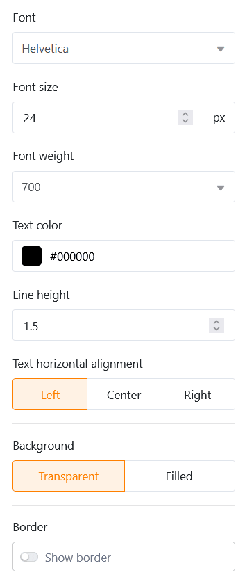
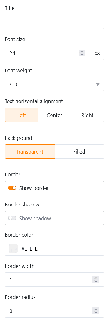
Text
Text elements are particularly suitable for headings or short texts that you want to place on your individual page.
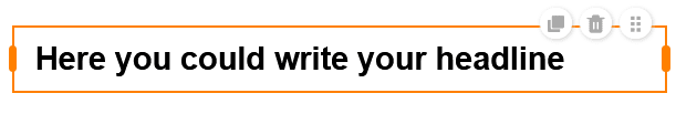
You can define numerous parameters in the element settings:
- Font type, size, thickness and color
- Line spacing and text alignment
- Background and framework
Formatted text
As the name suggests, you can use formatted text elements to format longer texts. This opens the text editor that you already know from the formatted text column type.
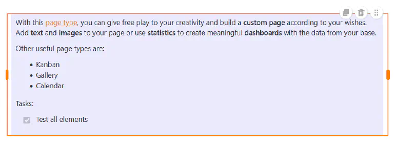
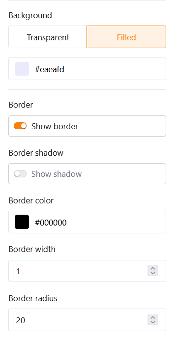
As you already have a wide range of formatting options in the text editor, you can only set the background color and the frame of the text box in the element settings.
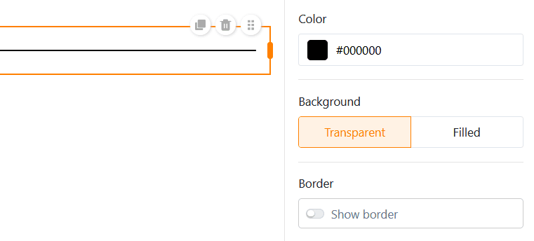
Horizontal line
To separate different areas on your individual page, you can draw a horizontal line. You can specify a color, a background and a frame.
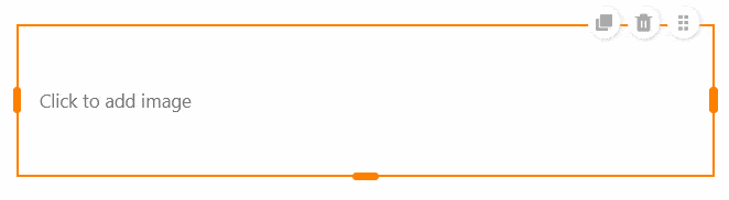
Images
You can easily add pictures to make your individual page more attractive. To do this, click on the picture frame that you have previously embedded in the page using drag-and-drop and upload the desired picture from your device.
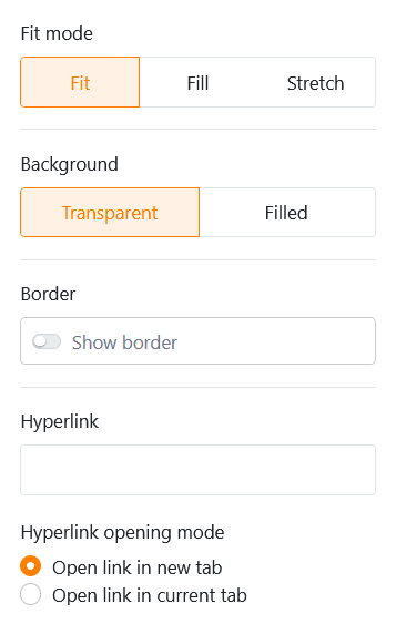
In the element settings, you can define the fill mode, the background and the frame of the image. You can also use hyperlinks to link other pages of the app or external resources on an image.
Container
A container provides a grid with which you can arrange other elements (e.g. texts, images, statistics) more easily and group them together. First of all, you therefore define how many rows and columns this grid should have. This results in the individual boxes into which you can insert other elements using drag-and-drop.
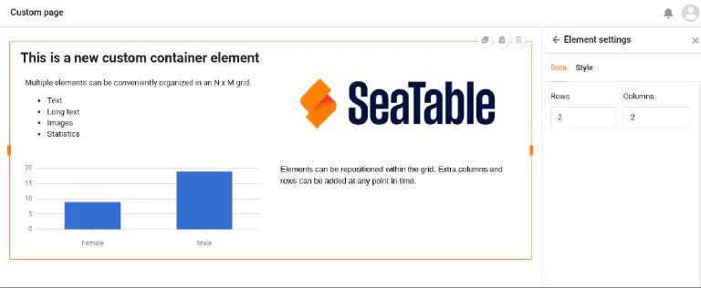
In the element settings, you can add a title to the container, the font size, font weight and alignment of which you can adjust. You also have the option of setting the background color and the frame of the container.
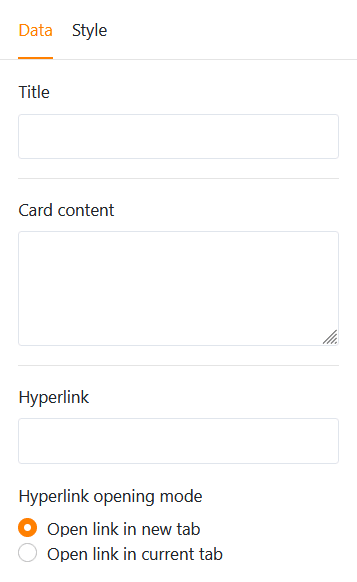
Card (design template)
The card, which combines an image, a headline and a text into a design template, also ensures a beautiful page layout.

You can insert an image, a title and card content (text) into this template. You can also use a hyperlink to link to another page of the app or an external resource.
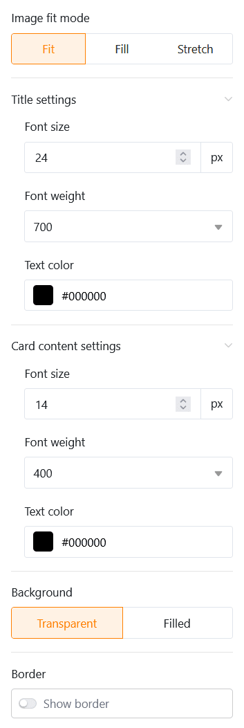
As far as the design of the card is concerned, you first have the option of changing the fill mode of the image. Next, you can adjust the font size, weight and color of both the title and the card content. Finally, you can set the background color and the border of the card.
Statistics
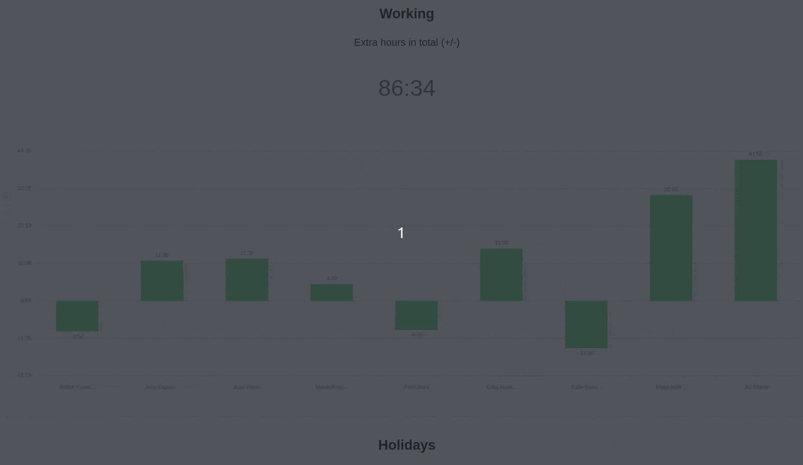
On an individual page of your app, you can visualize the data from the underlying base using various graphics and diagrams.
Data settings
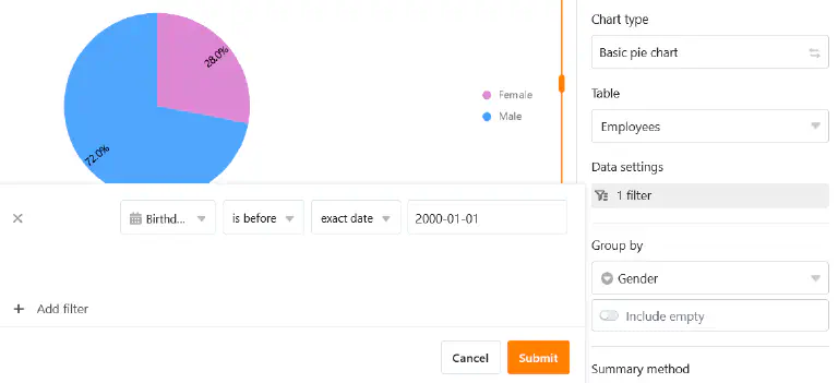
The configuration of statistics is very similar to the statistics module in the base. First select the table from which the statistics should display data. You can change the chart type by clicking on the opposite arrows.
You can filter the entries to narrow down the data displayed in the statistics. To do this, click on Add filter, select the desired column and condition and confirm with Submit.
You can also activate the drill-down function and specify exactly for which columns the data should be displayed when you click on the statistics. If the function is deactivated, the chart does not allow any deeper insights into the underlying data. The user only sees the chart itself.
For a bar chart, you must specify the column that is to provide the values for the x-axis. Click on the corresponding drop-down field and select the column. You can use a slider to set whether you want to include empty rows in the chart.
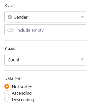
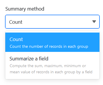
Then decide how the values should be displayed on the Y-axis. You can choose between the number of entries that have a specific value in the selected column and the Summarize field option, where you can evaluate either the sum, the average, the number of unique values, the maximum or the minimum in numerical columns.
For grouped charts, you can specify a column with options by which you want to group. For some chart types, you can also sort the data in ascending or descending order.
Style settings
Depending on the chart type, you have different style settings to choose from.
For example, you can make the following settings for a bar chart:
- Title, font size, font weight and alignment
- Display the title of the X and Y axis
- Automatic limits or minimum and maximum of the Y-axis
- Color and data labeling of the columns
- Frame (shade, color, thickness and radius)

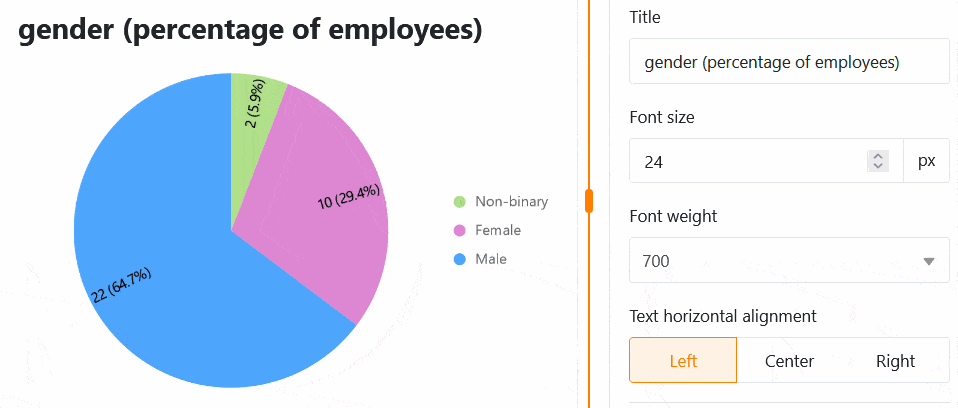
You can make the following settings for a pie chart:
- Title, font size, font weight and alignment
- Show legend and labeling
- Position, format and font size of the labels
- Minimum share of a sector
- Frame (shade, color, thickness and radius)
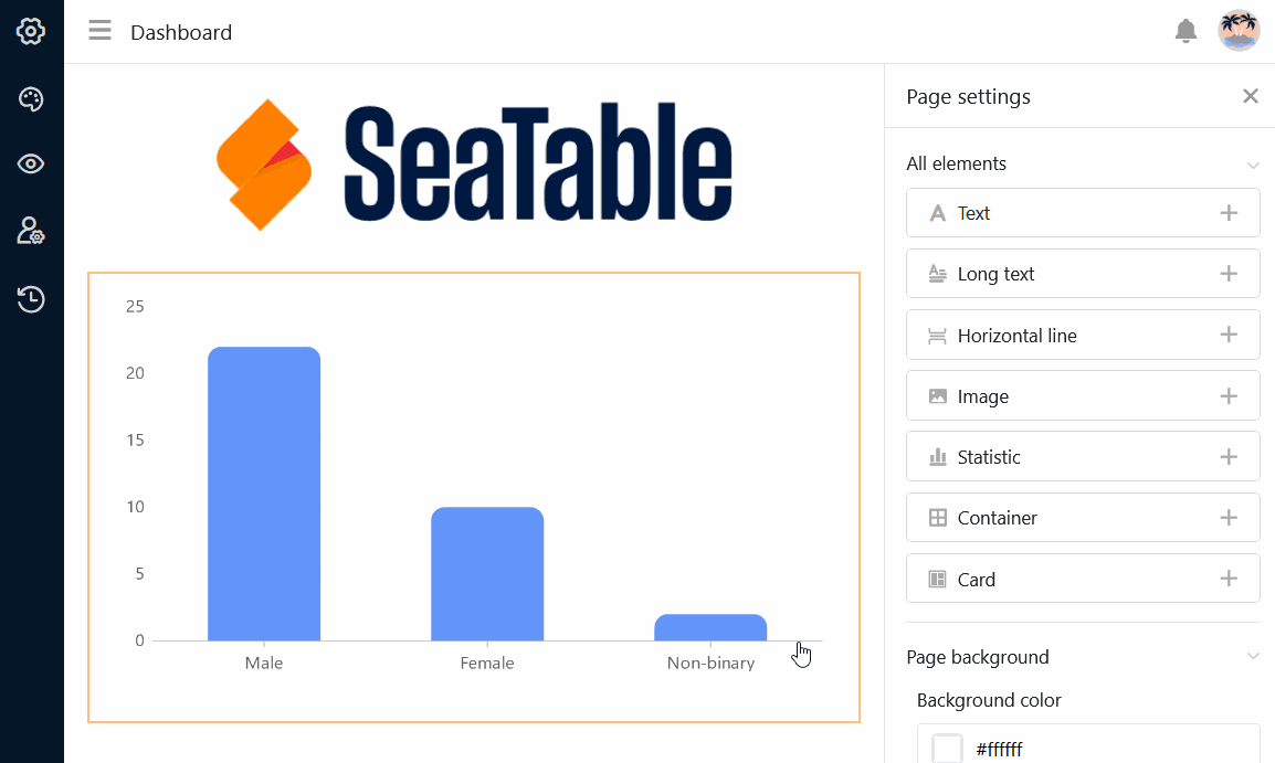
All setting changes are carried out in real time, i.e. the diagram is updated immediately each time a setting is changed. This allows you to see immediately whether you have achieved the desired result or need to make adjustments.
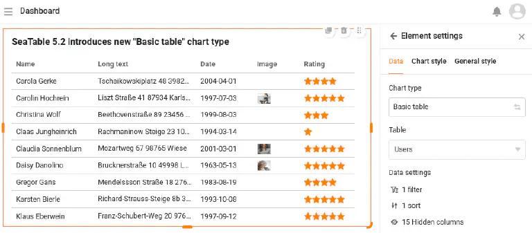
Simple table
There is a special type of statistics on individual pages: Similar to table pages , the simple table allows the tabular display of a data set that has been pre-filtered and pre-sorted by the app admin. Unlike on the table page, it is therefore possible to combine several tables on one dashboard.
Set the background color of the page
In addition to the colors of the individual page elements, you can also set the background color of an entire individual page.
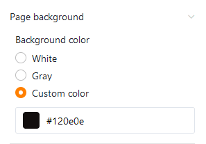
Choose between white, grey and your own color, which you can enter using a hexadecimal code or specify freely in the color selector.
Hide title bar
If you want to hide the title bar on an individual page, you can do this by activating the corresponding slider.
Page authorizations
Last but not least, you can limit who can see the page in the page settings.
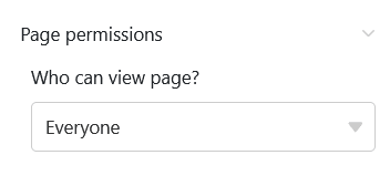
This is the only page authorization you have to choose from for individual pages - because individual pages cannot be used to add, change or delete rows in the table.