Table of Contents
With the statistics module, you can display the data from your table visually in the form of various graphs and charts. This is extremely useful for your work in SeaTable: thanks to the dashboards, you always have an overview of the figures and statistical developments in your base.
Open the statistics module
The statistics module is set up by default in every base. You can always access it via the “Statistics” button in the base header.

Create a graphic
- Open the statistics module and click on the button New chart in the top right-hand corner to add a new chart.
You have the option to choose from different types of graphs and charts. Scroll through the selection or click on the labeled icons in the options bar to jump directly to the desired location.
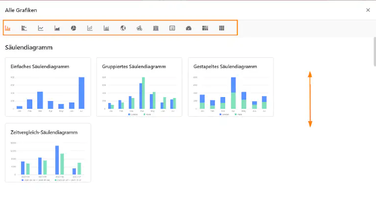
- Select the appropriate type for your statistics.
- Give the graphic a title. To do this, click on the pencil icon and enter the desired name.
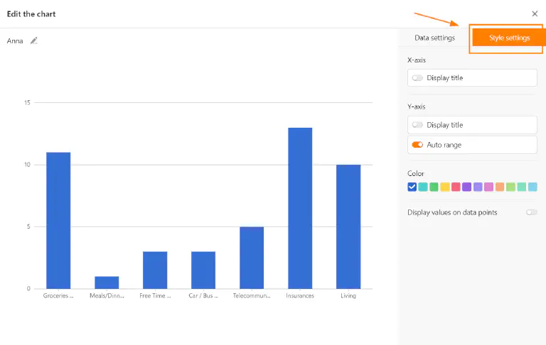
Data settings
- Specify from which table and view the statistics should obtain the data.
- Depending on the graph, you can make different data settings - for a bar chart, for example, which values you want to display on the X and Y axes.
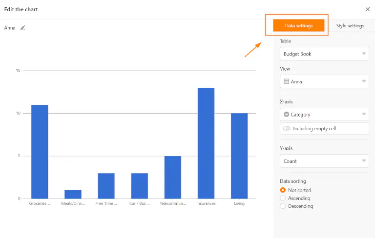
You start the detailed work on a column chart by selecting the column that will provide the values for the X-axis. Click on the corresponding drop-down field and select the column. You can use a slider to set whether you want to include empty rows in the chart.
Then choose how you want the values to be displayed on the Y-axis. You can choose between the number of entries that have a certain value in the selected column and the Sum field option, where you can evaluate either the sum, average, number of unique values, maximum or minimum in numeric columns. For grouped or stacked charts, you can specify a column with options by which you want to group.
All setting changes are executed in real time, i.e. the diagram is updated immediately with every setting change. This allows you to see directly whether you have achieved the desired result or need to readjust.
Style settings
- If the graphic you selected allows style settings, you can configure colors or data labels, for example.
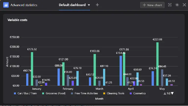
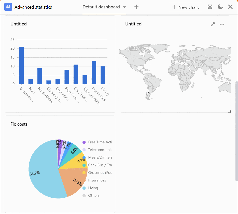
Graphics on the dashboard
- After you close the settings window, the saved graphic will appear on your dashboard.
You can create multiple dashboards and create as many graphics as you want on each dashboard. To change the order of the graphics, drag and drop them to the desired location. To do this, hover the mouse pointer over the title of a graphic until an arrow cross appears and hold down the mouse button.
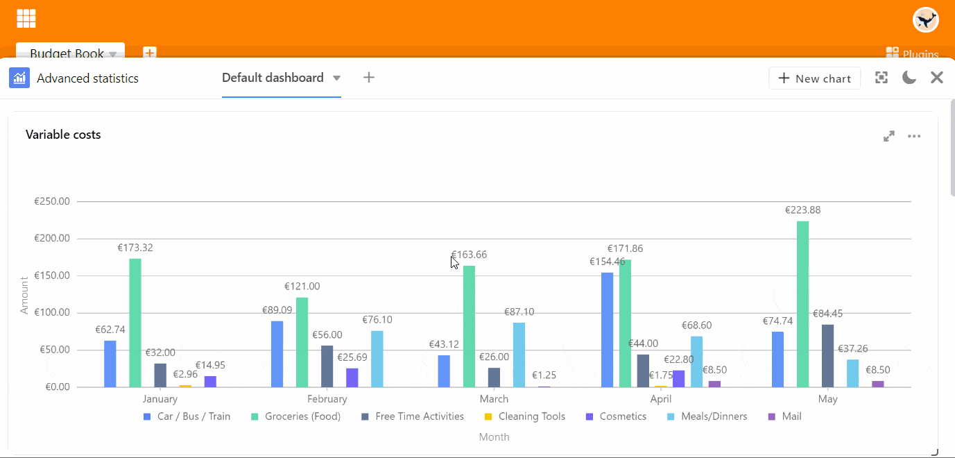
Options for a graphic
When you hover over a graphic, a double-arrow icon and a three-dot icon appear in the upper right corner. Select the double arrow to display a graphic in full screen mode. You can access all other options using the three dots:
- Edit graphic
- Copy graphic
- Export as image
- Delete graphic
More display options
By clicking on you can display the entire window of the statistics module in full screen mode.
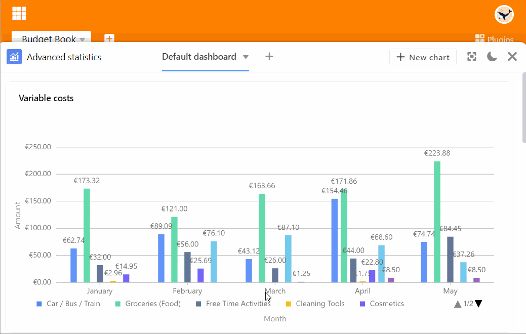
You can switch between light and dark mode using the and icons.